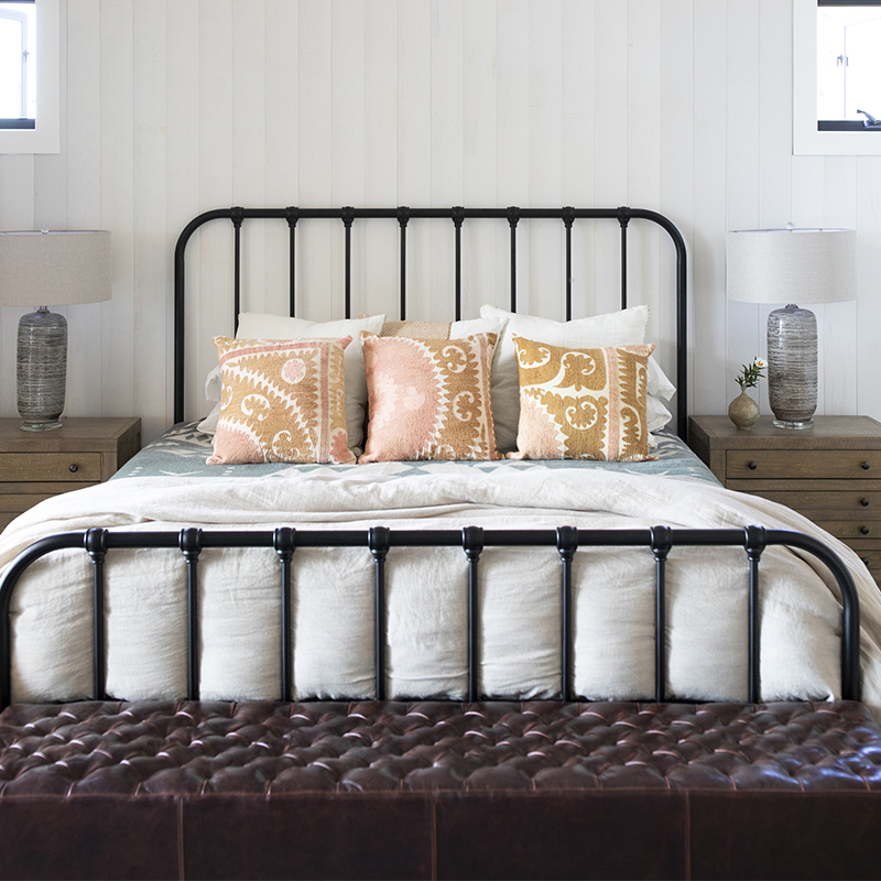
Q&A with Interior Designer Lacy Keller
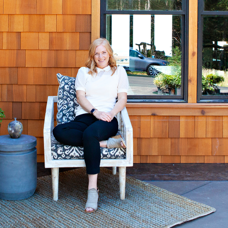
Lacy Keller is a Portland-based interior designer who lent her thoughtful eye to this year’s Street of Dreams in Oregon’s wine country. Choosing from our Northwest Color Collection, we got the chance to connect with Lacy about the inspiration behind the color palette she chose for the Vineyard View Lodge and her own personal take on what matters most when designing a home.
What influenced the color choices both inside and out at the Vineyard View Lodge?
A glass of rose. Just kidding! Sort of…
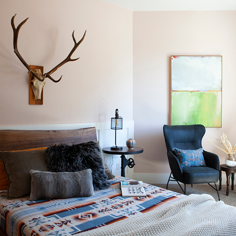
When given the challenge of using as many colors as I could, I knew immediately that we needed to have a pink room (Pointe Shoes | R121 ) – but in a more adult and way, and not too frilly. The builder is a hobbyist wine-maker and also builds for wineries, so having Rose as an influence was definitely a thing. The soft pink color that floods the surrounding landscape of the home at dusk was also inspirational.

Pointe Shoes | R121
The builder is also an excavator and logger, so colors of the forest were also an influence. My first time visiting the home, I imagined what the fall weather might look like – like a surreal forest-in-the-fog. Being a true Oregonian, I love that feeling, so I wanted to include a rich green (Vintage Shutter | R046) and a foggy grey (Chiseled Shale | R044) somewhere.
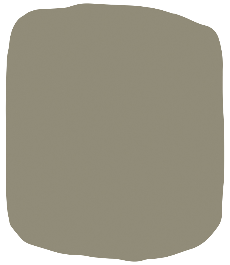
Vintage Shutter | R046
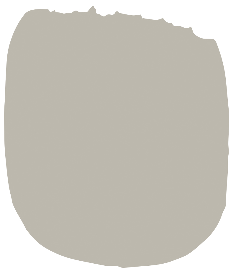
Chiseled Shale | R044
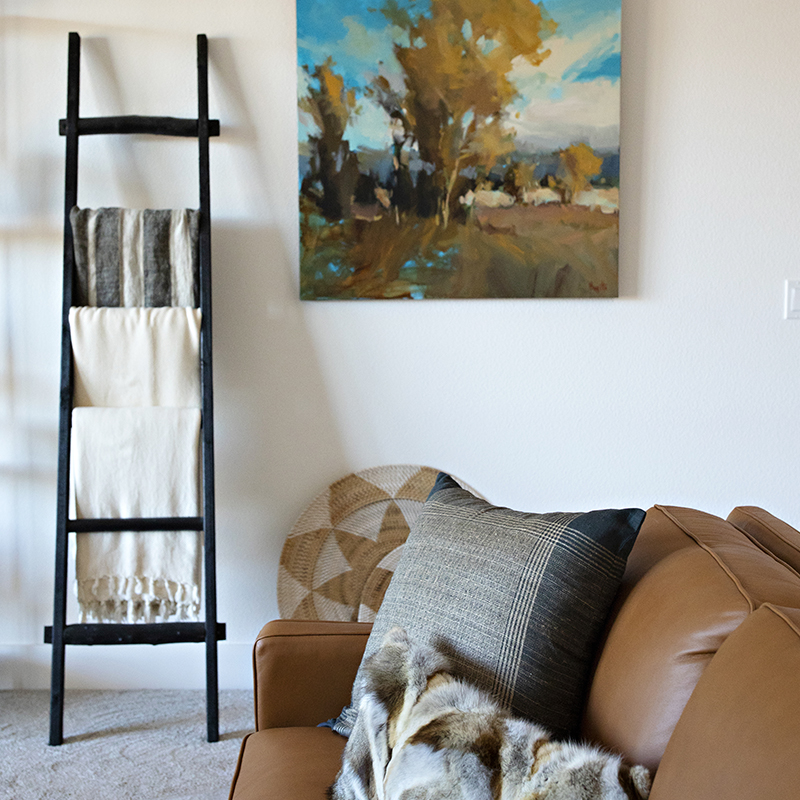
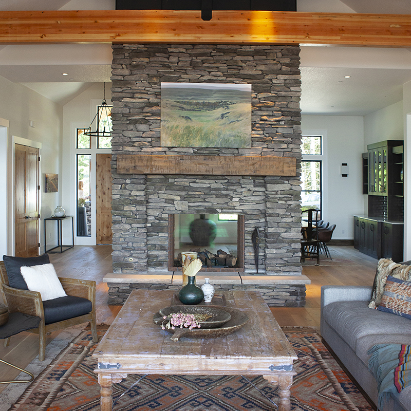
The current trend for interior paint is having pretty white walls – I wanted to have that clean gallery feel, but with a hint of warmth, so Zea Flour | R009 was the perfect choice for the main interior areas.

Zea Flour | R009
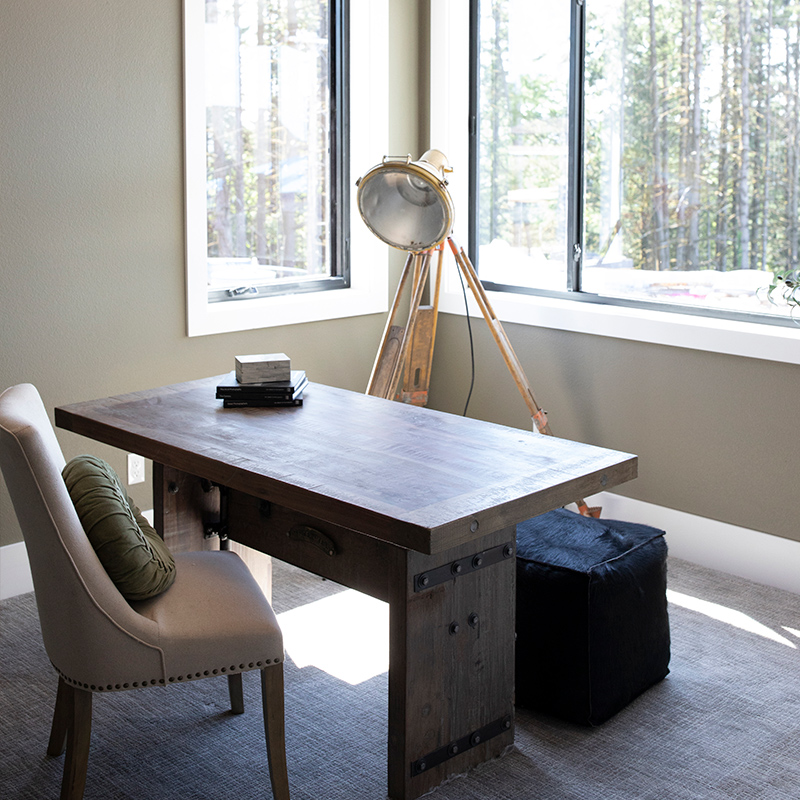
I thought the bedroom should have a little more depth, and went with the lightest of greys that doesn’t go too warm or too cool – Greek Pebbles | R004 - the perfect hue to work with when picking out furniture & decor

Greek Pebbles | R004
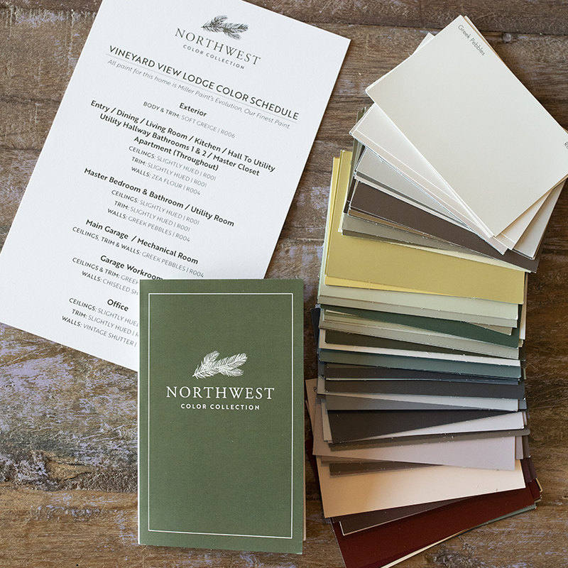
How would you describe Miller Paint’s new Northwest Color Collection and what do you like most about it?
I love how all of the colors from the collection are strong and bold without being in-your-face saturated. They are the best true Northwest colors I’ve ever seen.
When choosing colors for a home, what are the most important things to consider?
To me, the most important thing is choosing one color that works throughout as much of your home as possible – it should be a color that isn’t too warm or too cool, and typically not too dark. With the right balance of warmth and coolness, it’s much easier to decorate around.
I would also say for accent colors – commit the whole way. Do the whole room, not just one wall. Great places for accent colors are powder rooms, dining rooms, offices, etc. These are great areas to let a little bit of your personality show.
And if you must do just a wall or two, choose areas that makes the most sense from a transition standpoint or an area that has obvious stopping points.
What do you enjoy most about designing spaces?
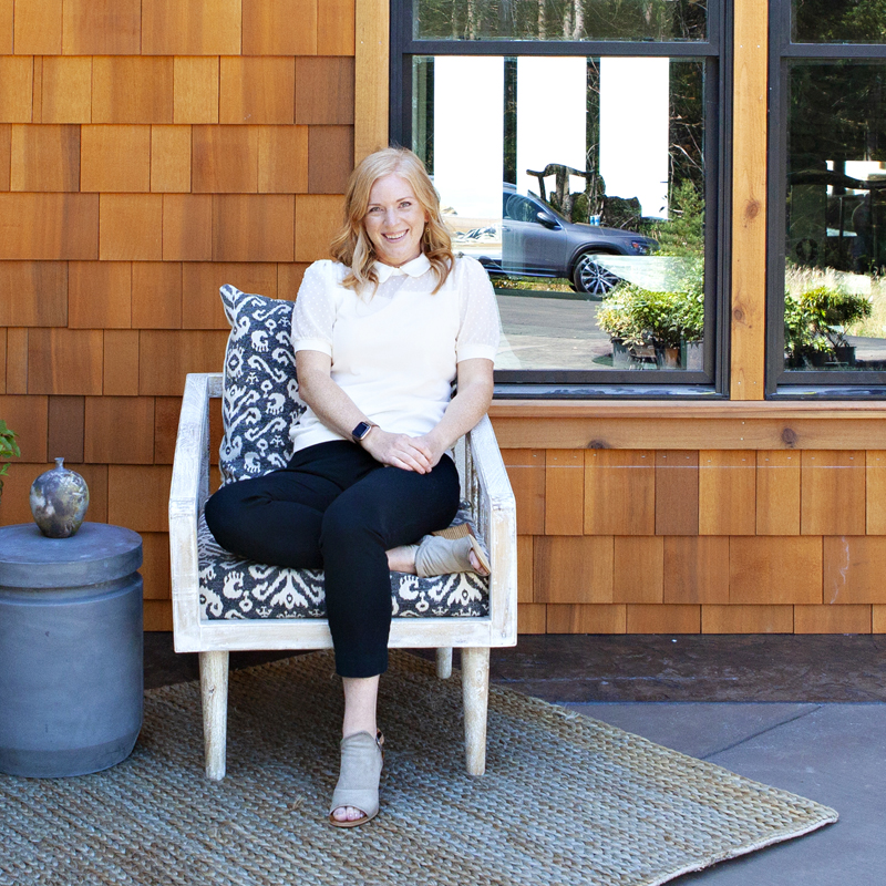
I love problem solving and striking balances within design. I like spaces that can read both warm or cool (rather than one or the other), and I love spaces that appeal to both masculine and feminine tastes. Designers always get asked what our “style” is – but I’ve often found that the house will tell me what it wants – so marrying the client’s aesthetic to what the house wants always feels like a successful project!
Thank you Lacy for sharing your story with us. You can see more of the Vineyard View Lodge here, and learn more about Lacy’s services at www.lacykellerinteriors.com.

