How to Choose a Color for Your Front Door
Choosing the right color for your front door can be an overwhelming task with so many colors to pick from! But don’t fret. We have come up with a way to help you narrow down the options and find the right color for your front door. Our method is simple- just keep in mind the 3 C’s - Contrast, Complement, and Character - and you will guided you to the perfect hue.
CONTRAST
Functionally, a front door signals where to enter a home. But, it also says “welcome” to visitors and guests. By using a contrasting color on the door, it makes it clear where to enter and exit and it also offers the opportunity to set the design tone for the house. Contrast can mean a difference in value ( light vs dark) or color (muted vs saturated).
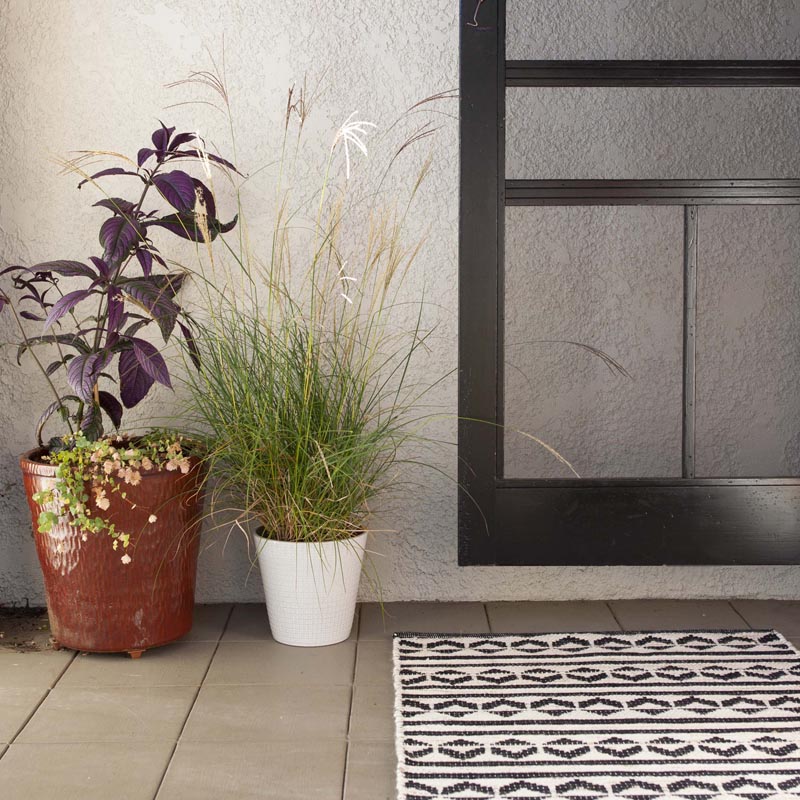

In this example, the black door stands out in contrast to the cream-colored house. The color used on this front door is Black Licorice | 0529 and the stucco is painted Bauhaus Buff | E0128, a classic black and white combination.
Front Door Swatch: Black Licorice | 0529
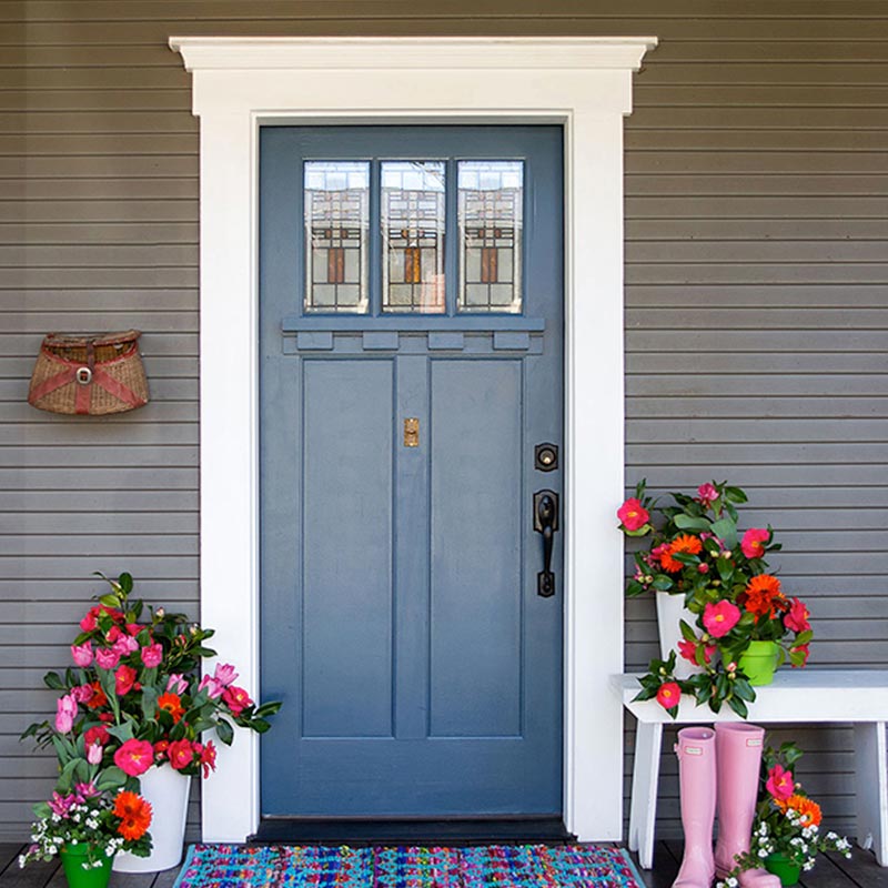

In this example, the blue front door pops against neutral gray siding with white trim. The color used on this front door is Day Spa | 0634 – a rich and vibrant blue framed in Sugar Dust | 0011 trim and King Fischer | 0577 body – that adds a touch of whimsy to the porch.
FRONT DOOR Swatch: Day Spa | 0634
COMPLEMENT
If a color appears not quite right on a front door, most likely it is because the undertones do not match those of the existing exterior palette. Undertones are the shadow colors behind a main color that become more visible when a color scales. Making sure that the undertones in your front door color complements the rest of the colors used on the house is the key to a harmonious palette.

Filtered Forest | 0706
is an example of a green with blueish undertones.

Green Song | 0762
is an example of a green with yellowish undertones.
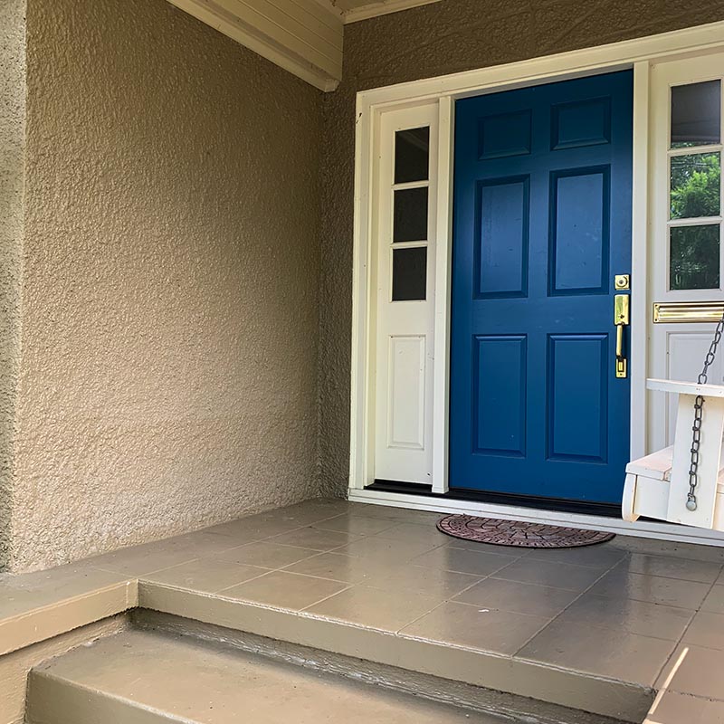
At this house in SE Portland, the original blue used on the front door did not have the same grayish undertones as the colors on the rest of the house. With the stucco painted muted Vintage Gold | 0282 and the trim harmonious warm white Bonaire | 0020, the front door color needed to be knocked down in saturation in order to better harmonize with the rest of the house.
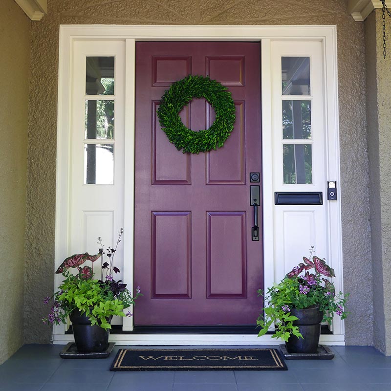

By choosing a color for the front door with similar undertones like muted maroon Kung Fu | 0109, the door now complements the body color instead of fighting against it. Maroon, burgundy, and plum tones are solid sophisticated alternatives to classic red for front doors. On the color wheel, purple is opposite of yellow and therefore they are complementary colors. That means when paired near or next to each other, they activate each other. Thinking about complementary colors is only one good rule of thumb when choosing your front door color, as that activation will make your front door stand out.
CHARACTER
Consider your home’s character when choosing a front door color. This is a chance to reinforce your home’s architecture, express your personal style, and create visual interest in the front of your home.
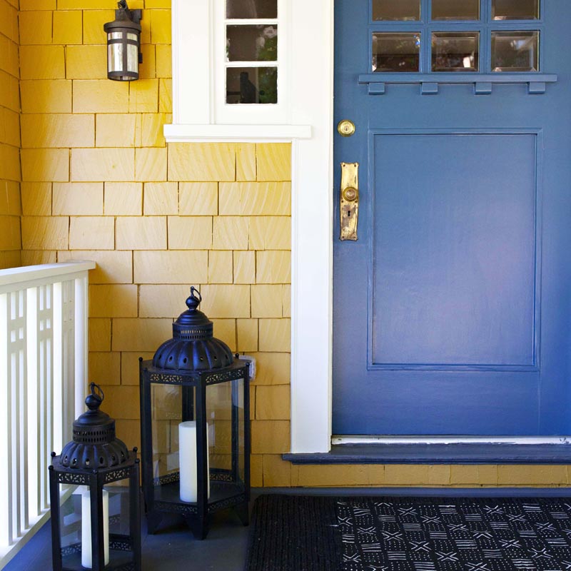

Craftsman style homes can handle brighter and bolder colors as there is plenty of architectural detail to highlight. This home followed the 3 C’s - clear color contrast between the Georgian Yellow | H0024 body and Day Spa | 0634 front door, warm undertones on the body, trim, door create a complementary palette, and the Craftsman character of the house is highlighted with bright and bold color choices.
Front Door Swatch: Day Spa | 0634
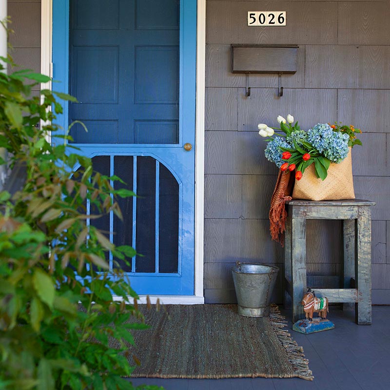

The screen door is the shining star of this front porch. Surrounded by neutral siding, the use of Acapulco Dive | 0639 - a happy and bright hue, adds character to this home. Consider using an unexpected hue to make a splash!
Front Door swatch: Acapulco Dive | 0639
Still have questions about the right color for front door? We are here to help! Ask one of our color experts a question or have one of our design professionals come to your home.
