Can-lidsdd2

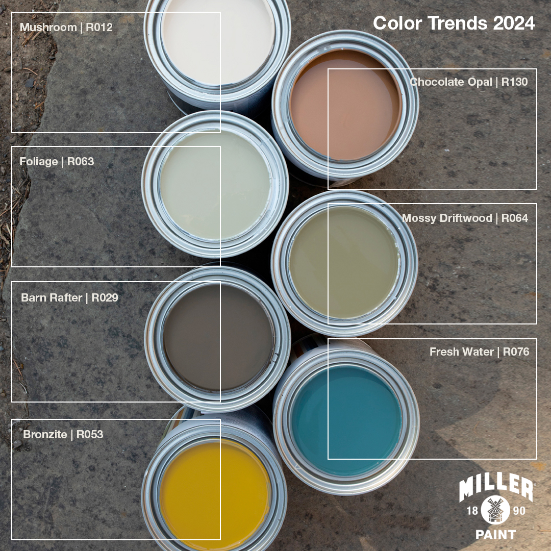
Color Trends 2024

Explore the palette of supporting hues that highlight the versatility of our Color of the Year — Mushroom | R012. From earthy hues like greens and brown that are reminiscent of the forest floor to more saturated colors that add interest and energy, see our favorite colors to pair with this complex color.

Supporting Hues

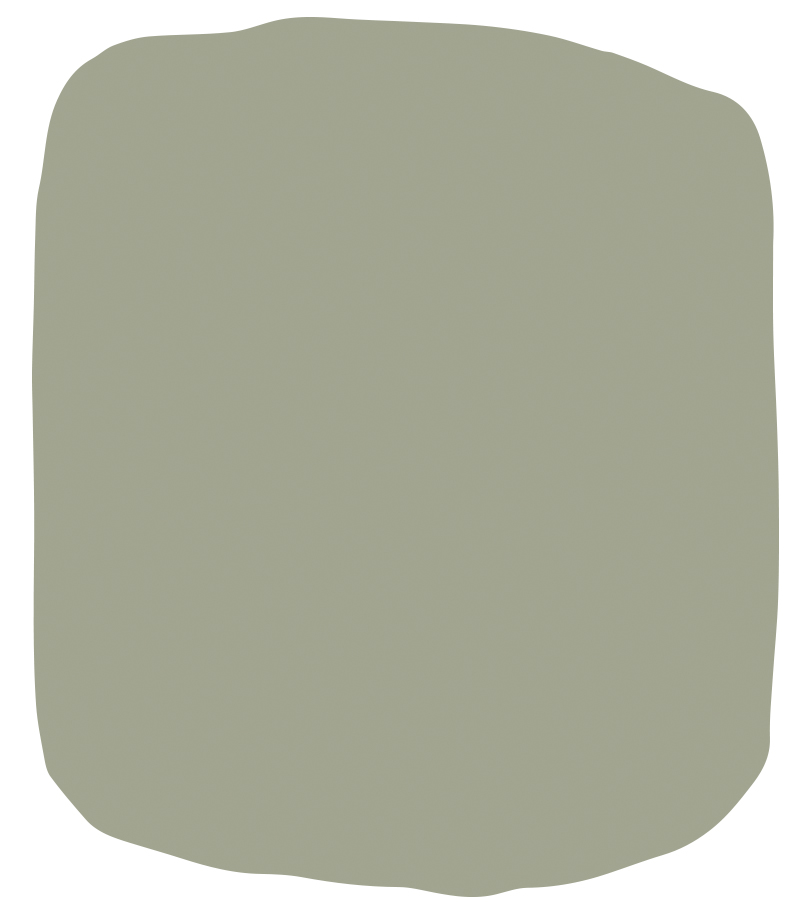
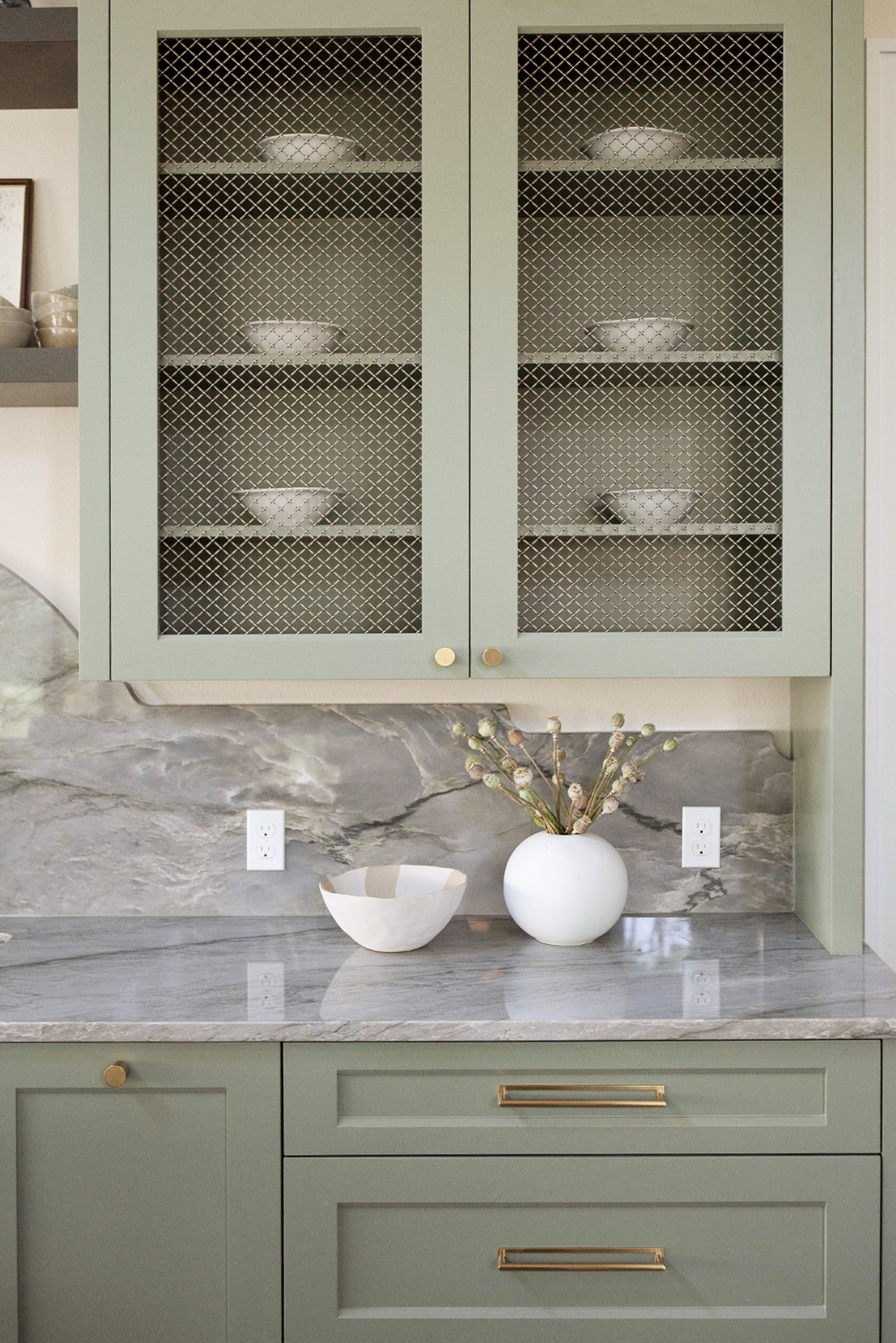
  • Foliage | R063 - a soft sage green with a touch a blue, this soothing hue just feels good.
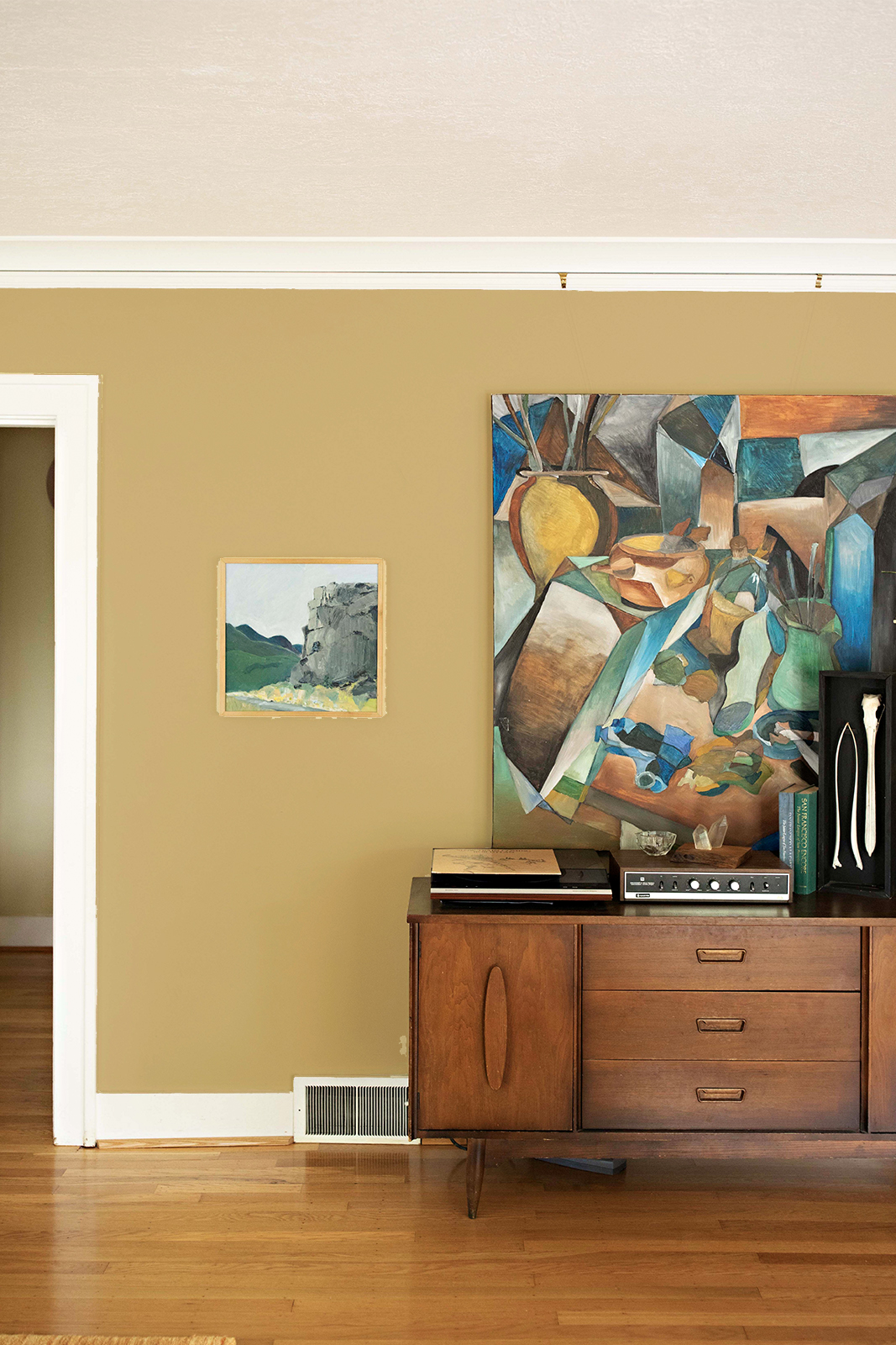
  • Bronzite | R053 - this greenish gold offers a natural glow to any space.
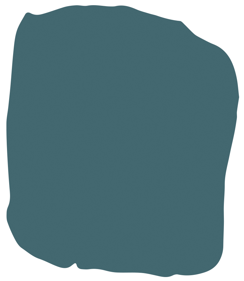
  • Fresh Water | R076 - cool and refreshing, this clear blue begs you to jump in.
  • Mossy Driftwood | R064 - the perfect cabin color, this color blends green and brown with ease.
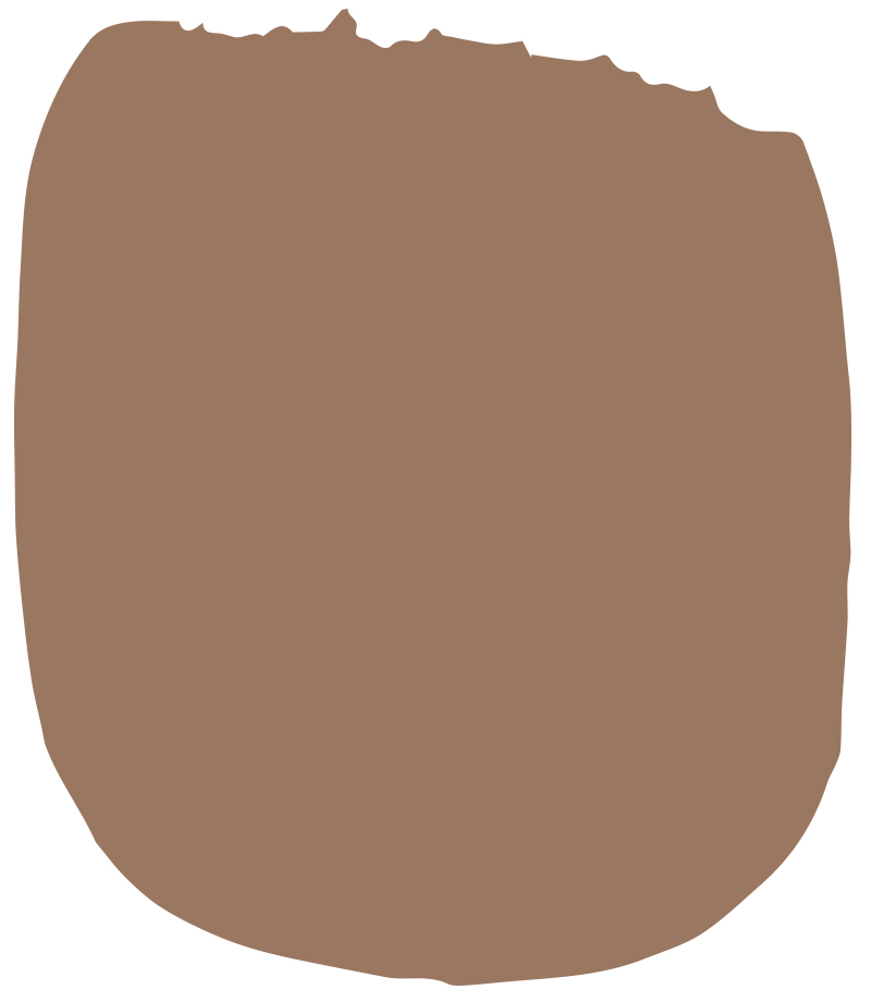
  • Chocolate Opal | R130 - a nurturing neutral, this color terracotta hue is easy to love.
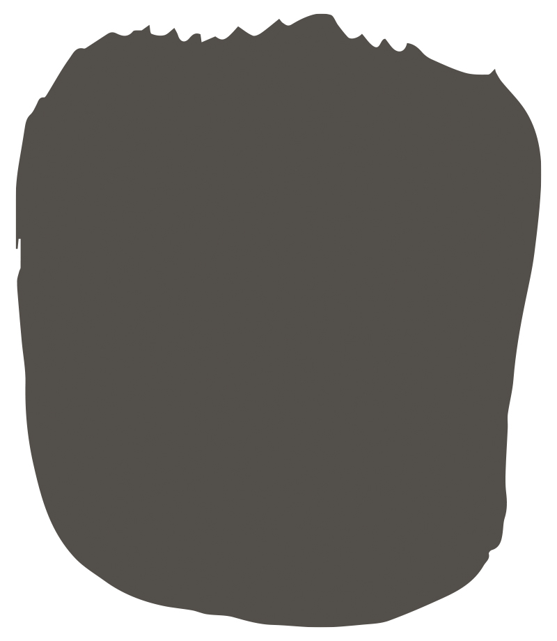
  • Barn Rafter | R029 - a rich, chalky brown, use an alternative to gray or black for an earthy elegance.
Foliage | R063

Foliage | R063

Bronzite | R053

Bronzite | R063

Mossy Driftwood | R064
Mossy Driftwood | R064

Fresh Water | R076
Fresh Water | R076

Chocolate Opal | R130
Chocolate Opal | R130

Barn Rafter | R029
Barn Rafter | R029

hues_0005_Cabinets copy
Foliage | R063

Foliage | R063 — a soft sage green with a touch a blue, this soothing hue just feels good. Use on cabinetry to make a soft statement.
hues_0002_Layer 4 copy 2
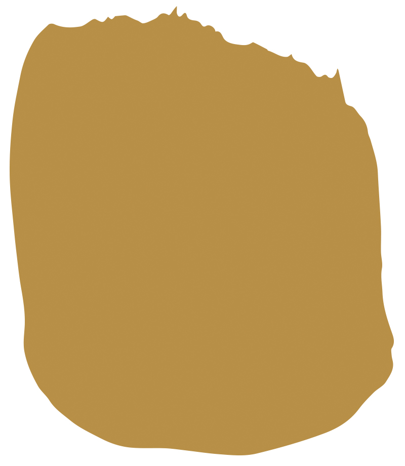
Bronzite | R053

Bronzite | R053 — this greenish gold offers a natural glow to any space. Don’t be a afraid to use this color in a living room or den as it will almost guarantee good conversation.
hues_0001_Layer 2
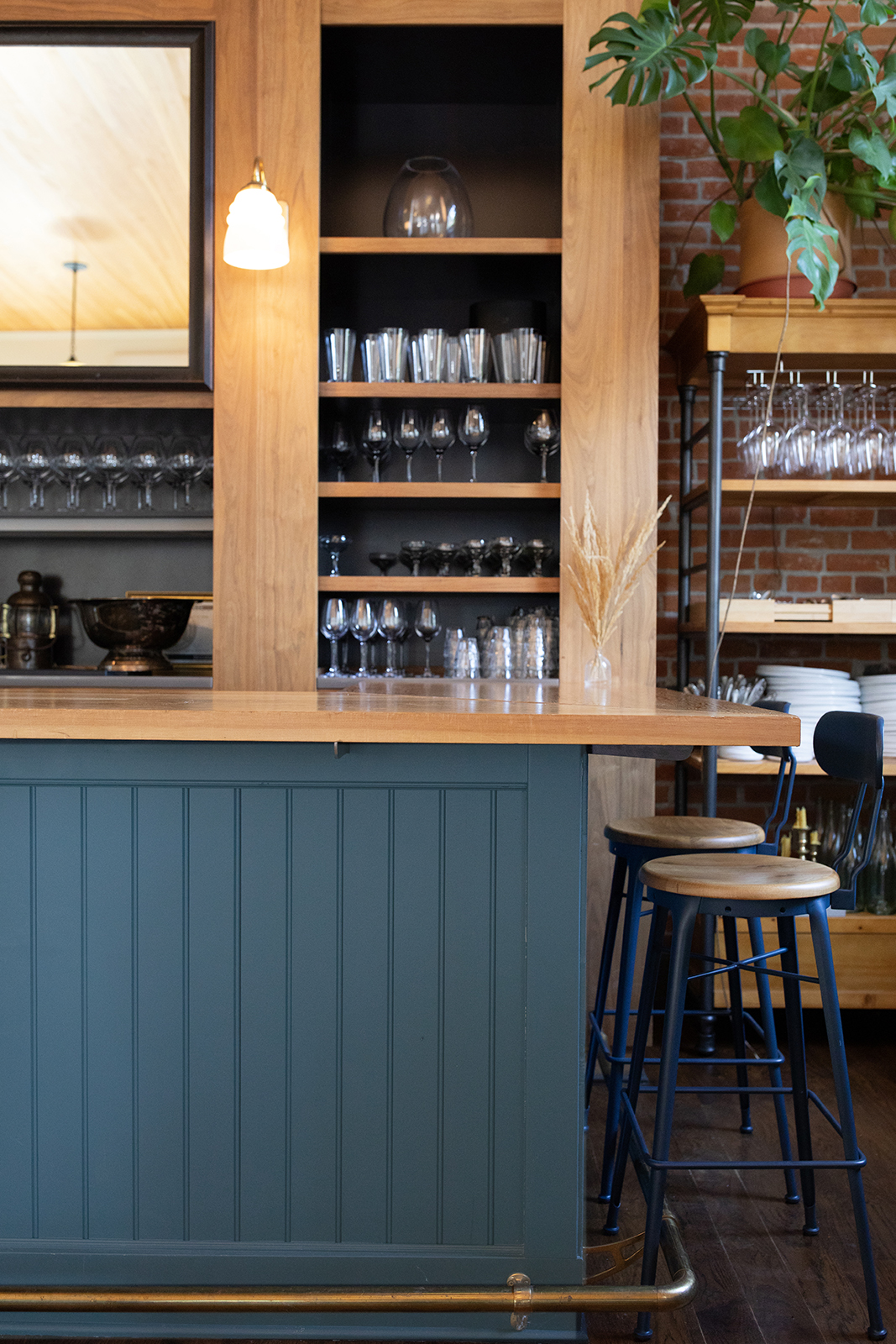
Fresh Water | R076

Fresh Water | R076 — cool and refreshing, this clear blue/green begs you to jump in and stay awhile. Consider using this hue on a kitchen island or bar where an accent is welcome.
hues_0003_Exteriro 1 copy
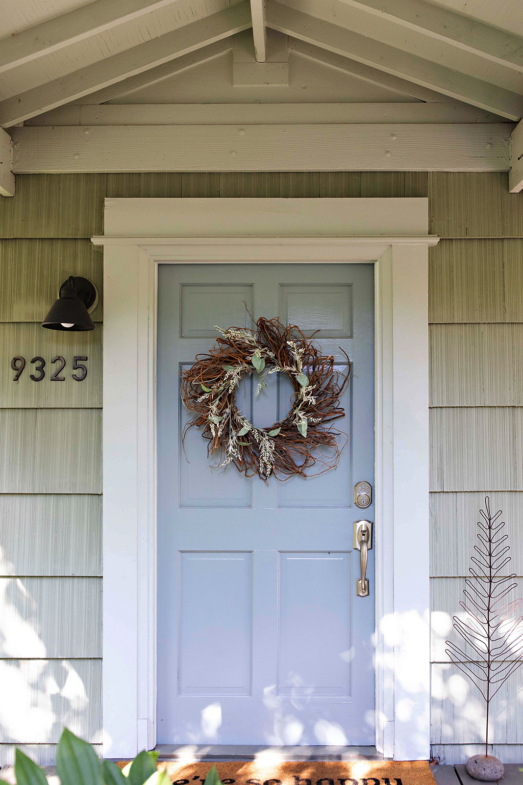
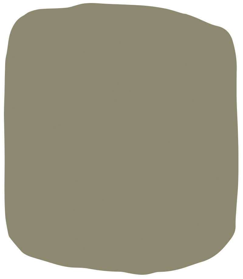
Mossy Driftwood | R064

Mossy Driftwood | R064 — the perfect cabin or cottage color, this color blends green and brown with ease. An easy choice for exteriors, this color will act as a neutral for any other colors you want to pair with it.
hues_0000_Layer 4 copy
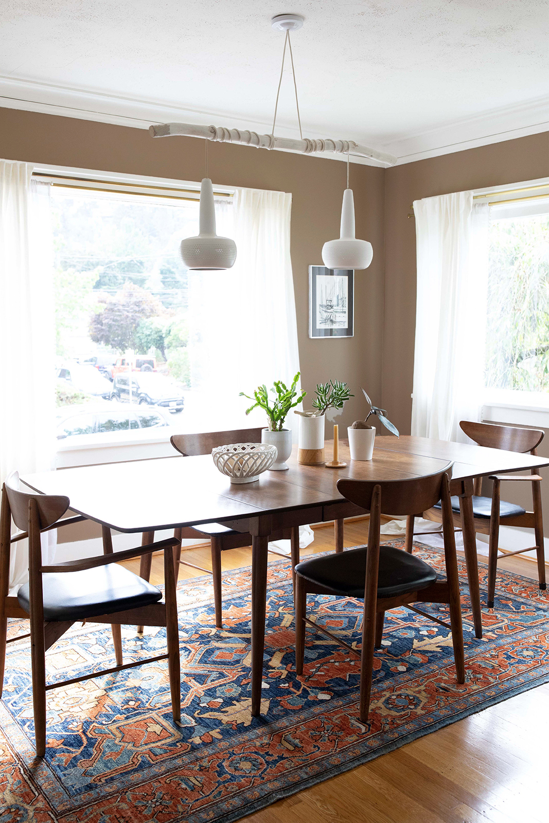
Chocolate Opal | R130

Chocolate Opal | R130 — a nurturing neutral, this color terracotta hue is easy to love. Use in kitchens and dining rooms to make a statement, but in a more relaxed way than red.
hues_0004_Exterior 2
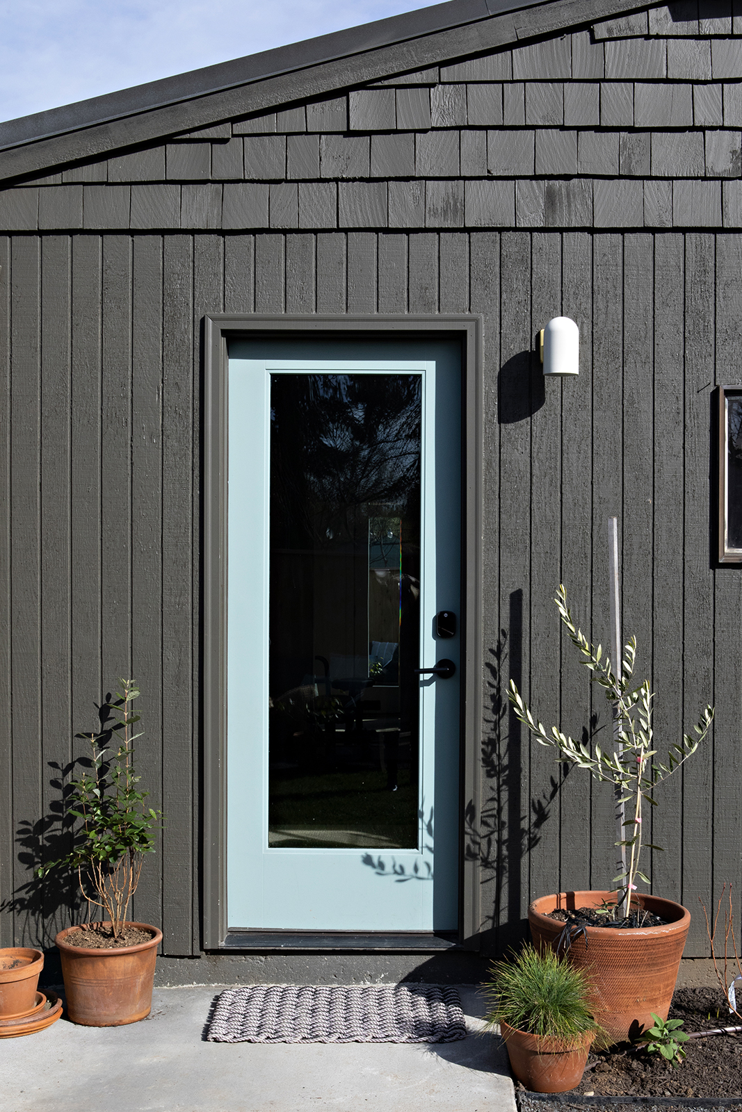
Barn Rafter | R029

Barn Rafter | R029 — a rich, chalky brown, use as an alternative to gray or black for an earthy elegance on exteriors. More timeless than trendy, this color is grounded in confidence and complexity.

Related Blog Posts

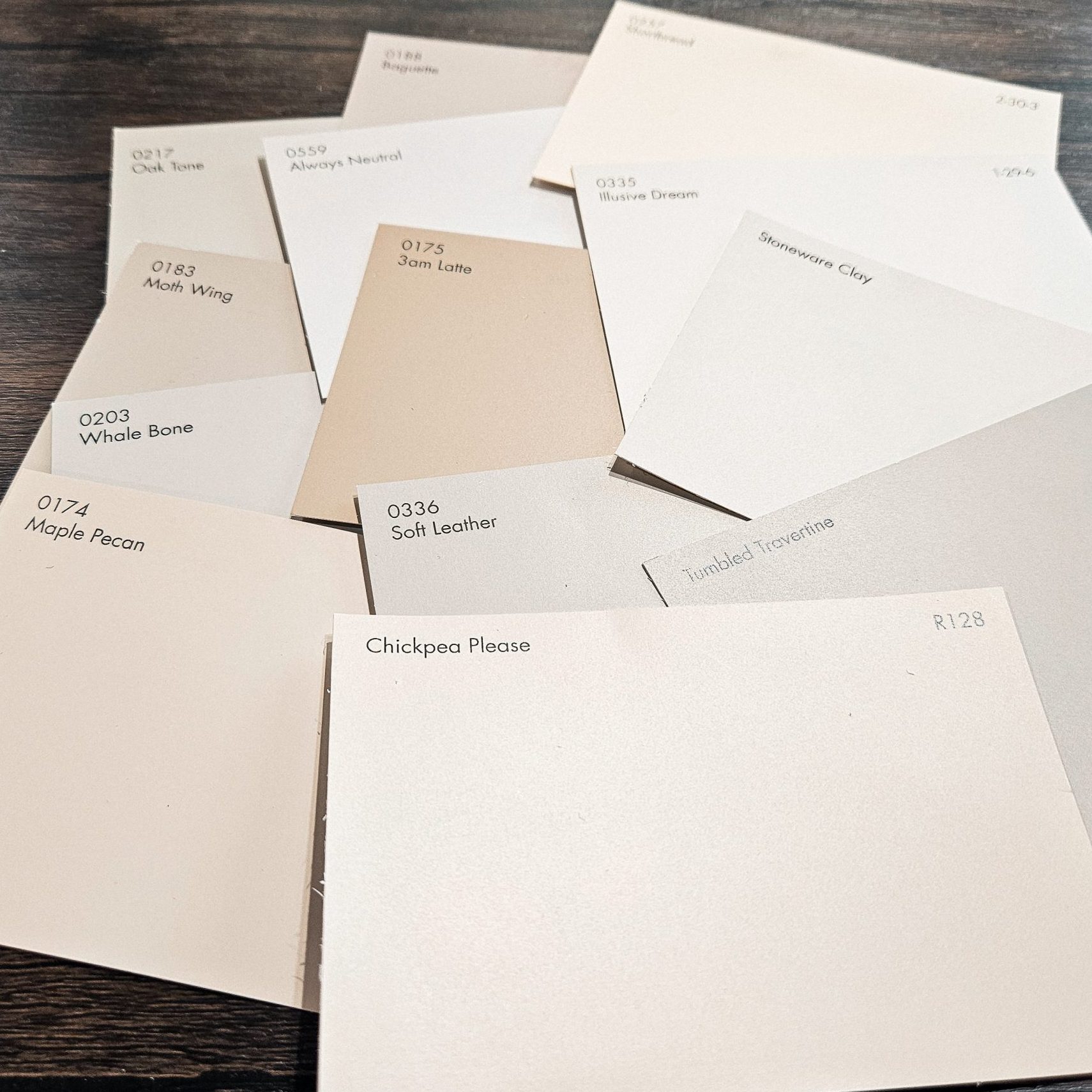
Finding Your Perfect Beige

Often dismissed as bland or dated, beige is a versatile and sophisticated hue that can add warmth, elegance, and a touch of timeless style to any space. The key to mastering beige and keeping it from looking dated lies in selecting the right shade that complements your existing decor and personal aesthetic. Let's dive into the world of beige and discover how to find the perfect match for your home without sacrificing contemporary appeal.
Read More

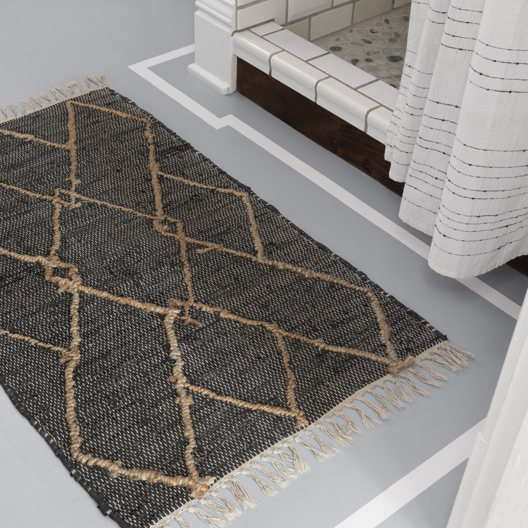
PAINT THIS: Stripe Border Floor

Transform your floor with a fresh look and a pop of color! This DIY project is easier than you think. With the right supplies and a little patience, you can achieve a stunning floor that will elevate any room. Let’s get started!
Read More

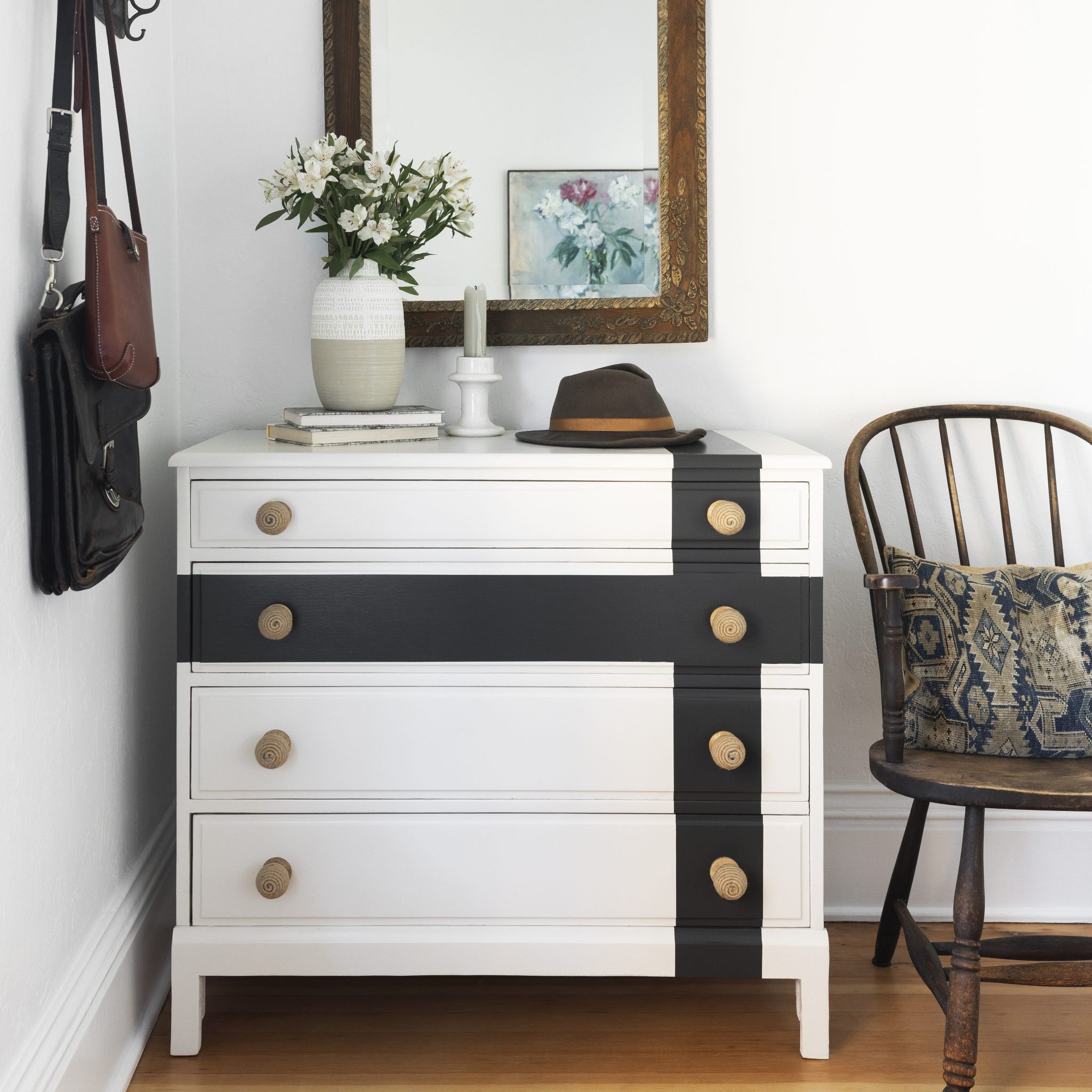
PAINT THIS: Crisscross Stripe Dresser

Is your dresser feeling a little drab? It's time to give it a fresh, modern look! This DIY project will transform your old dresser into a stylish statement piece. With just a few simple steps and Miller Paint's stunning colors, you can achieve a bold crisscross stripe design that will elevate any room.
Read More

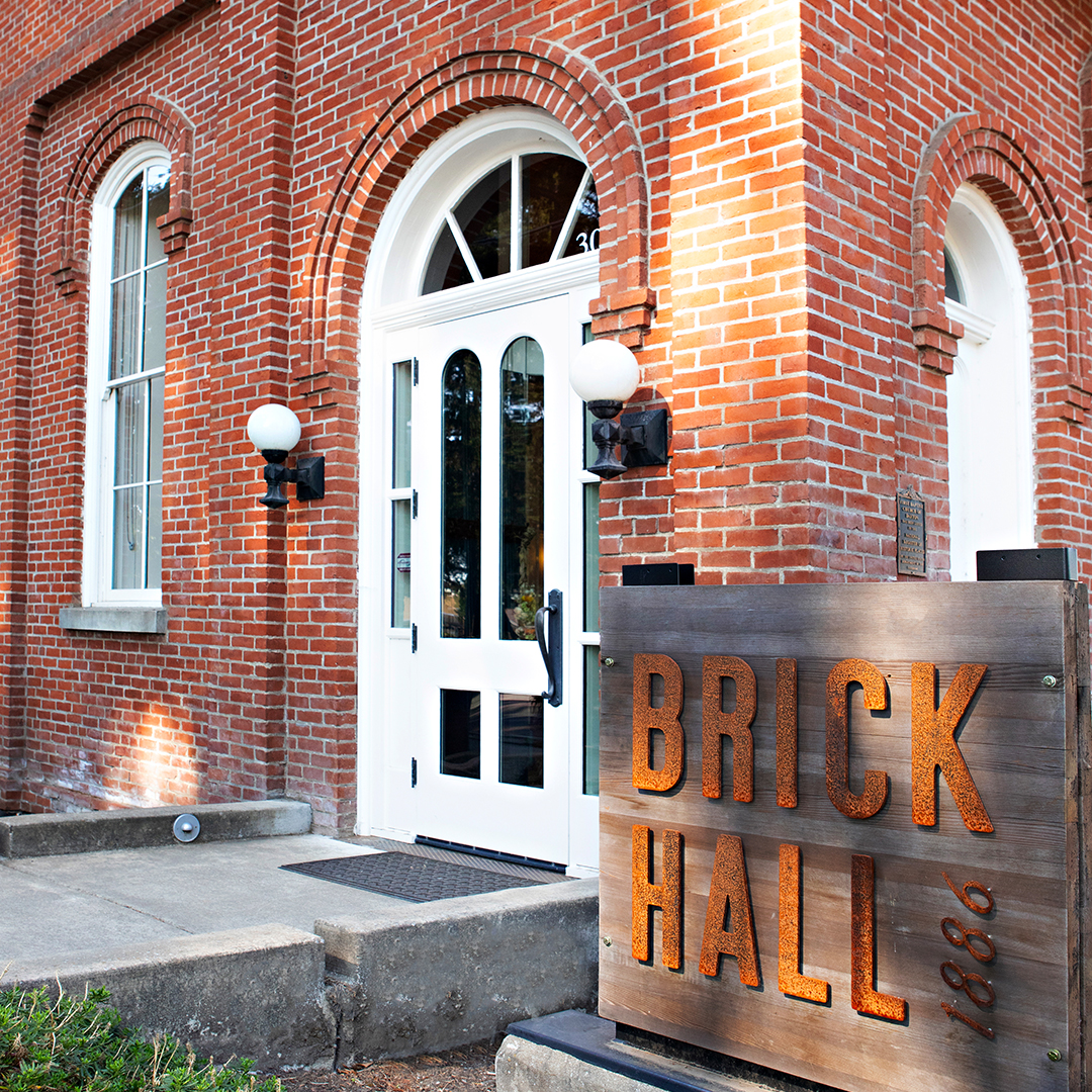
COLOR TOUR: Dayton, Oregon’s Historic Brick Hall

In the heart of Oregon wine country, a historic church in Dayton has been beautifully restored and is now a restaurant and event space called Brick Hall 1886.
Read More

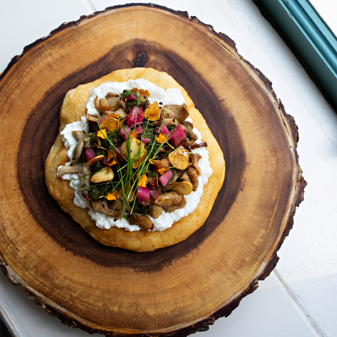
Mushroom Pizza Fritta Recipe from Tournant

In honor of our 2024 Color of the Year - Mushroom | R012 from our Northwest Color Collection, we connected with chefs Mona & Jaret of Tournant.
Read More

How to Choose the Right White

Choosing a white for your painting project seems easy right? I mean really- how hard can it be? “White” is the most popular color for interior spaces for many reasons including the fact that it is a neutral backdrop for furnishings, tile, carpeting, and artwork.
Read More

Feeling inspired? Browse all of our colors here. >