Color Story No. 4 | Garden Greens
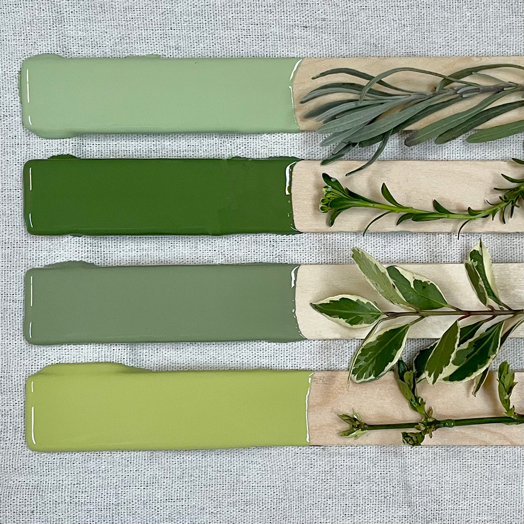
The color green brings a natural balance to interiors and exteriors. Similar to a walk in the forest or a day spent planting this summer’s veggies, shades of this calming hue connect our homes to the world outside. Used on exterior siding or a front door, green takes cues from the surrounding landscape and amplifies its beauty. Used inside, green is easy to live with and suitable for any space — from kitchens to bedrooms. Like layers of leaves found in the garden, this color embodies a gentle energy that feels fresh and affirming when leaning towards yellow and grounding and gorgeous when moving into blue.
Mother Nature | 0746
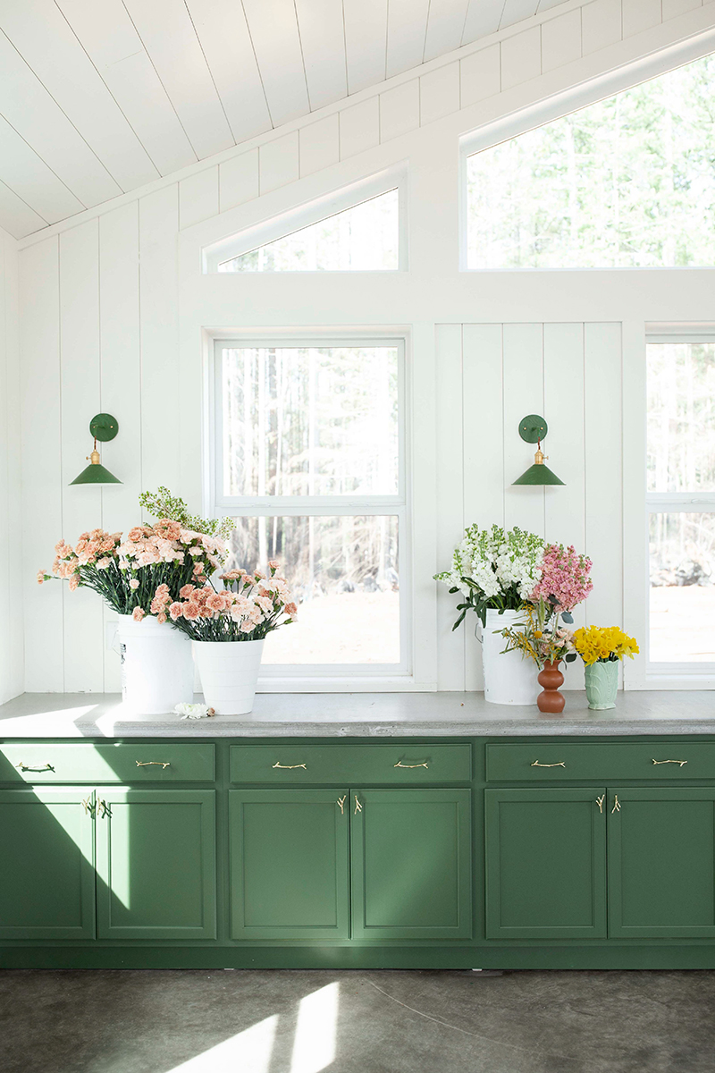
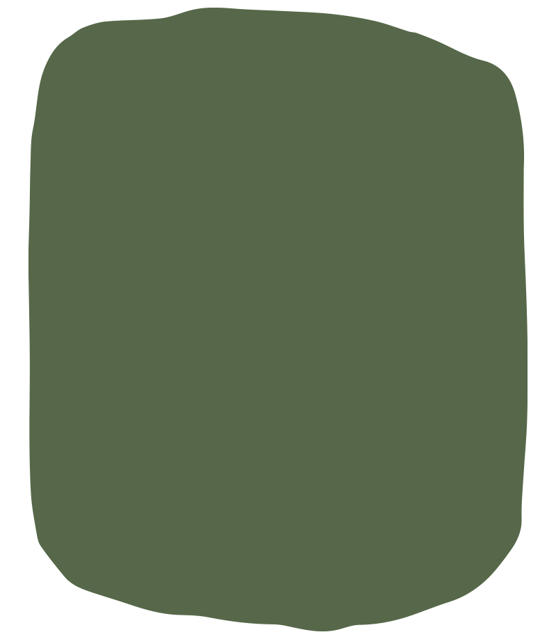
This color embodies its name — vibrant, thriving, and powerful. A medium value green, Mother Nature | 0746's dark enough to be grounding, but light enough to bring energy. For these reasons, Mother Nature is the perfect choice for the cabinetry found at the potting shed at Hillockburn Farm in Estacada, Oregon. The grass-green cabinets add an uplifting contrast to the rest of the light-filled space and does not compete with the colorful blooms that find a home here on market days. In fact this color only complements, staying true to its name and nature.
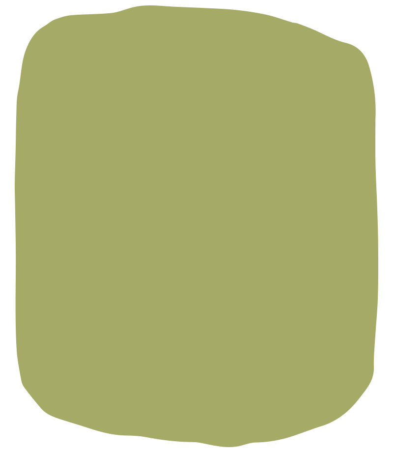
Peter Pan | 0786
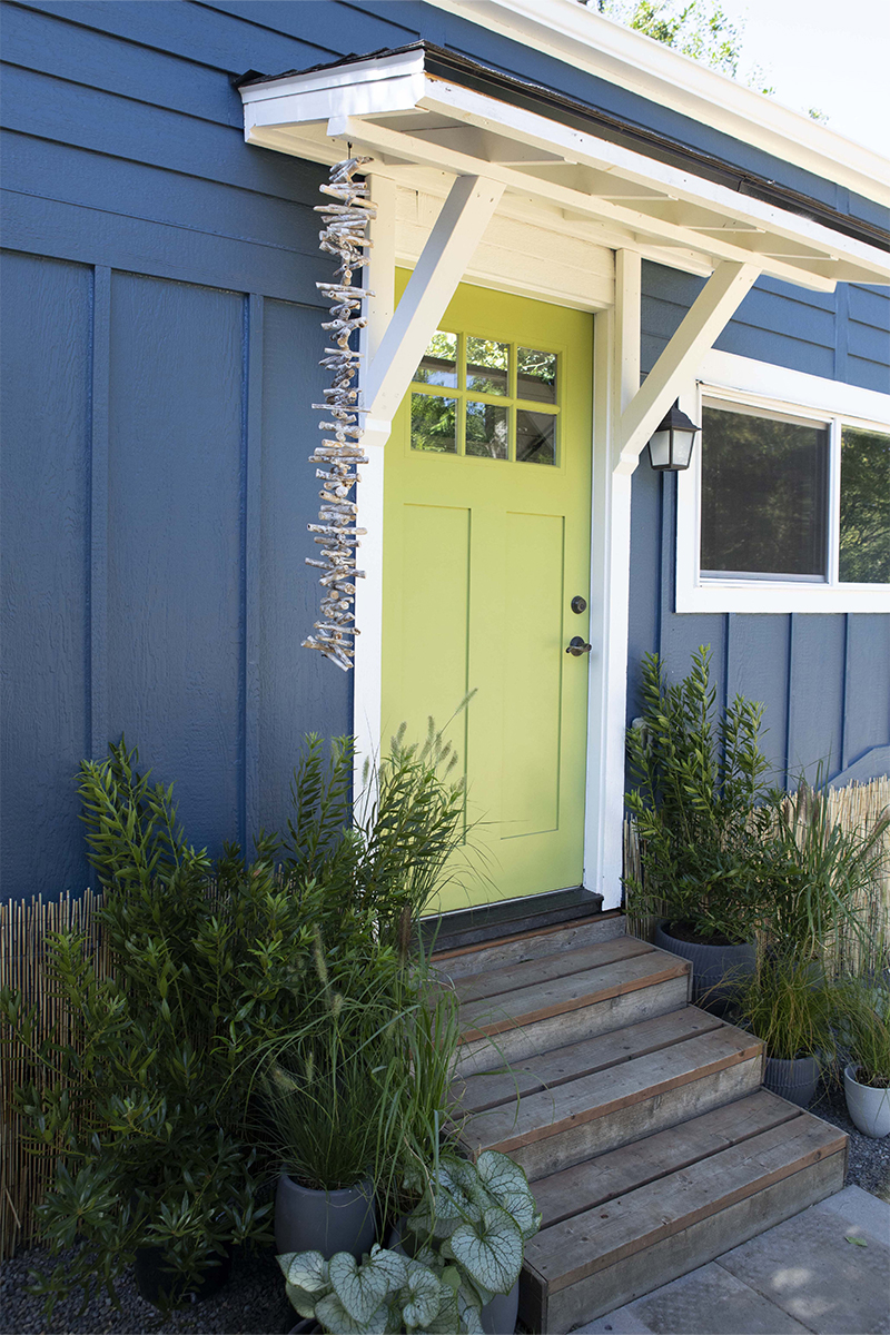
Playful and peppy, Peter Pan | 0786 is a favorite on front doors. This color gets along with pretty much every hue, making it a go-to when looking for a pop of color to energize a palette. An adaptable green, Peter Pan can make for a happy welcome on the front door of a beach bungalow at the Oregon Coast or add some fun to a sophisticated mid-century modern home in Portland’s Southwest Hills.
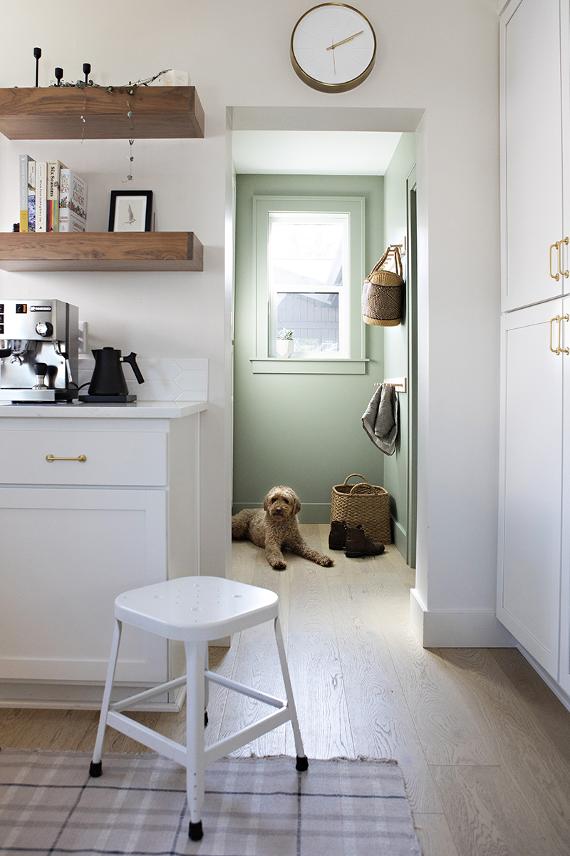
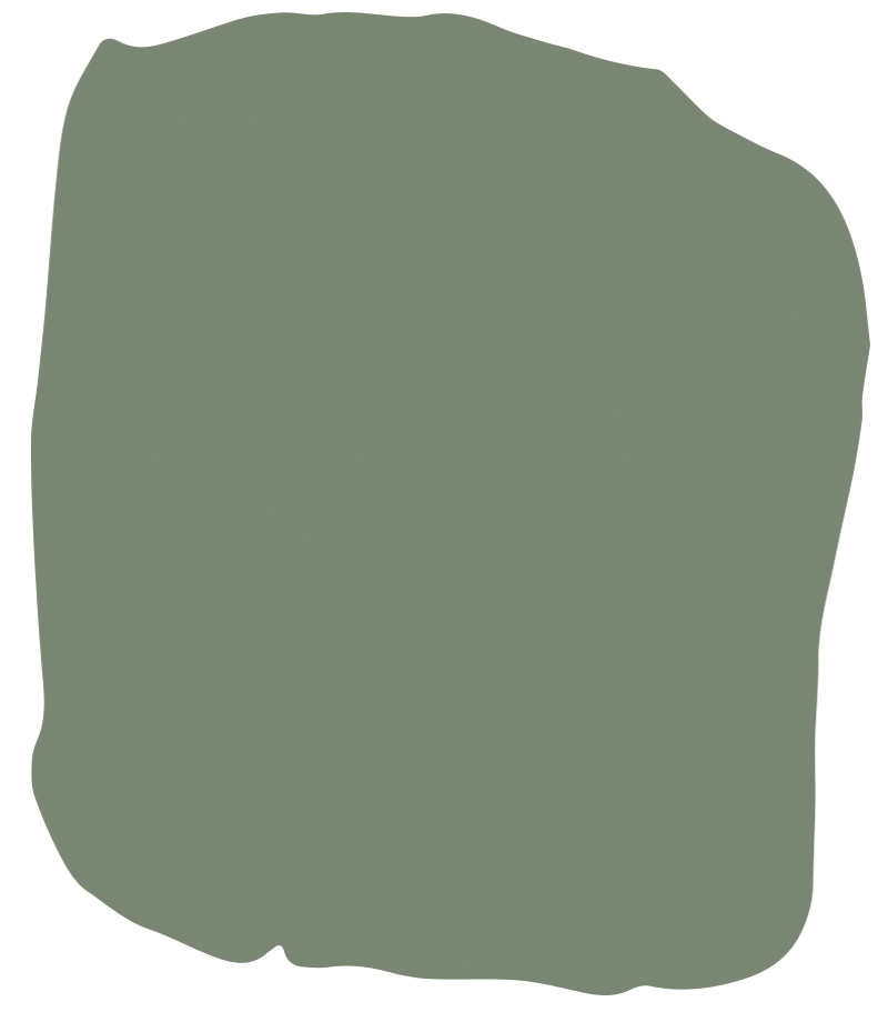
Forest Walk | R059
Serene and soothing, Forest Walk | R059 offers the same feeling as taking a deep breath surrounded by trees on a misty morning walk. Use in compact spaces like mudrooms, pantries, and powder rooms for a gentle coloristic surprise. Forest Walk is muted enough to be considered as an all-over hue on walls, ceilings, and trim. A mix of contemporary and historic, Forest Walk feels right at home in a range of architectural styles.
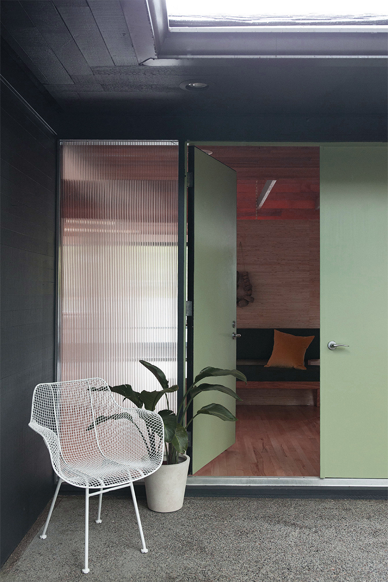
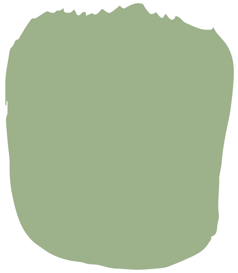
Venetian Glass | H0079
Luminous and vibrant, Venetian Glass | H0079 makes a special statement. When used on a front door or in an entry way, it lets guests know that a confident and charismatic person lives inside. This color likes to take the lead and bring the energy, which is why it pairs so well with more grounding neutrals like moody blacks, rich grays, and deep browns. Thanks to its blueish undertones, Venetian Glass transcends any particular period, so feel free to use wherever your heart desires. Ours is particularly smitten with front doors, kitchen islands, and bathroom wainscoting painted in this garden green.
