Cargo Astoria’s Colorful Transformation
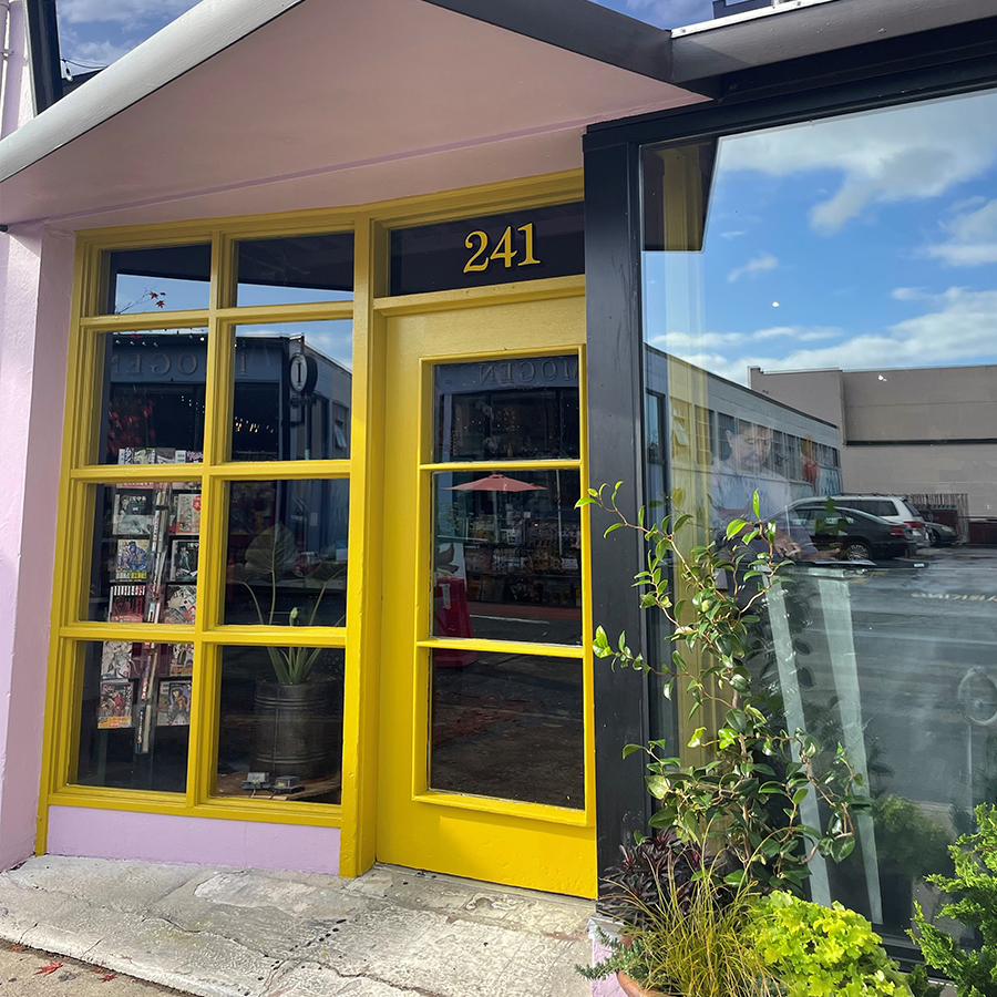
Cargo in Astoria, Oregon recently relocated to the corner of 11th and Marine Drive. Originally a car dealership, this building recently got a colorful makeover both inside and out. We took some time to talk with Cargo’s co-owner and interior designer, Bridgid Blackburn, about the inspiration behind this new location’s bold and energizing color palette.
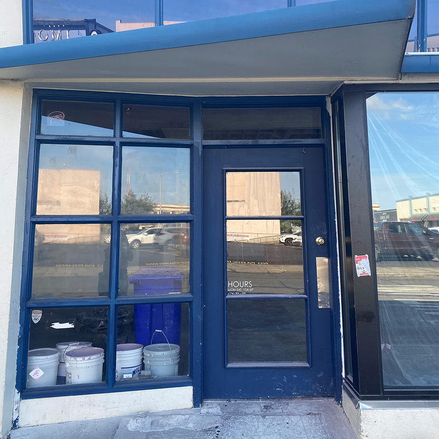
BEFORE
What was design inspiration behind the color palette you chose for the new Cargo location in Astoria?
When I started the process of the color selections, I had what I thought might be an impossible design challenge! The historic corner storefront has the original transom windows, which are blue glass, and the previous owners had painted the tile roof & building trim a medium toned grey/blue, and the stucco body was painted flat white. I was sure that the windows would need to be replaced!
But after spending time inside the space, with the light coming through the windows I started to see the glass differently. I started to think of the Ball canning jars & collectable cobalt glass from the early 1900s, and the thrill of finding a bit of blue “sea glass” when beach combing – we decided to see the glass as an element to highlight rather than fight against.
So then the challenge became how to best accent the glass with a palette that had historic roots and that would support our colorful international artifacts, but also felt fresh and clean.
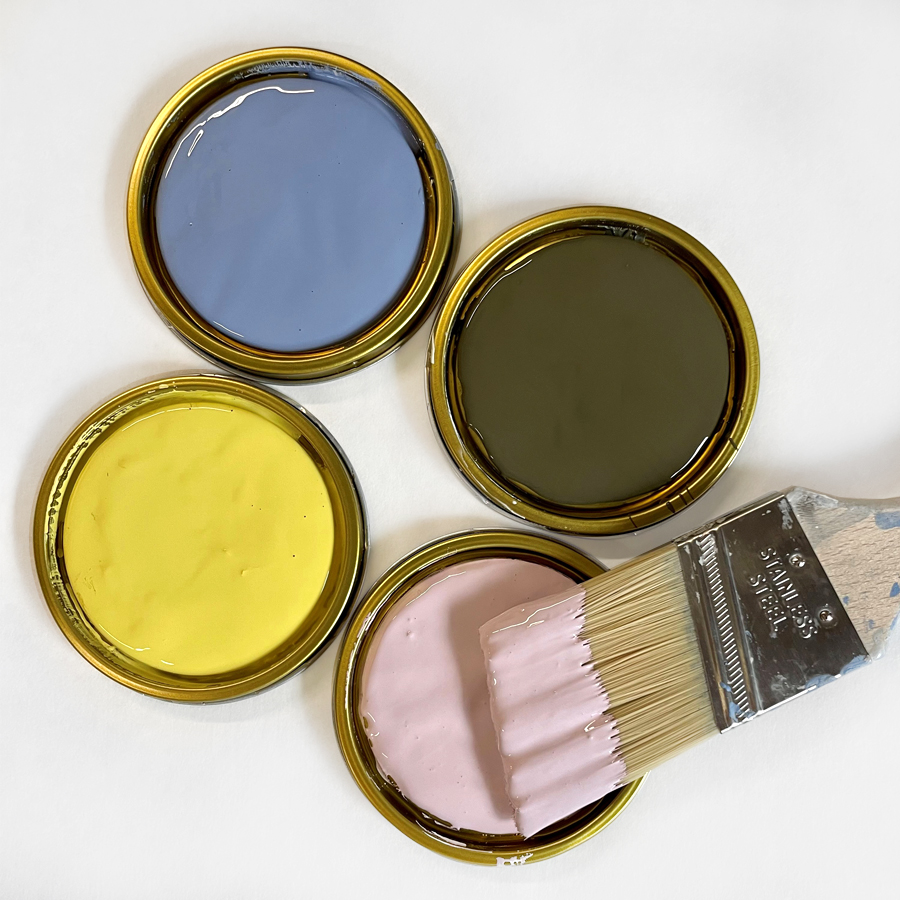
I knew that I wanted a bright light-giving ceiling color that was not white, and deep golden wall color for the walls furthest from the windows. I fell in love with Desireé | 1219 because it is light yet complex – and was such an unexpected ceiling color! Desireé has the unique ability to play well with both warm and cool colors and to change in value with different lighting. Once we landed on Desireé, and the gold wall color Yellow Lupine | 0808, I knew I needed to add a blue accent color, and a deep trim color to finalize the palette. We chose Blue Jacket | 0591 and Evermore | 0557.

Desireé | 1219

Yellow Lupine | 0808

Blue Jacket | 0591

Evermore | 0557
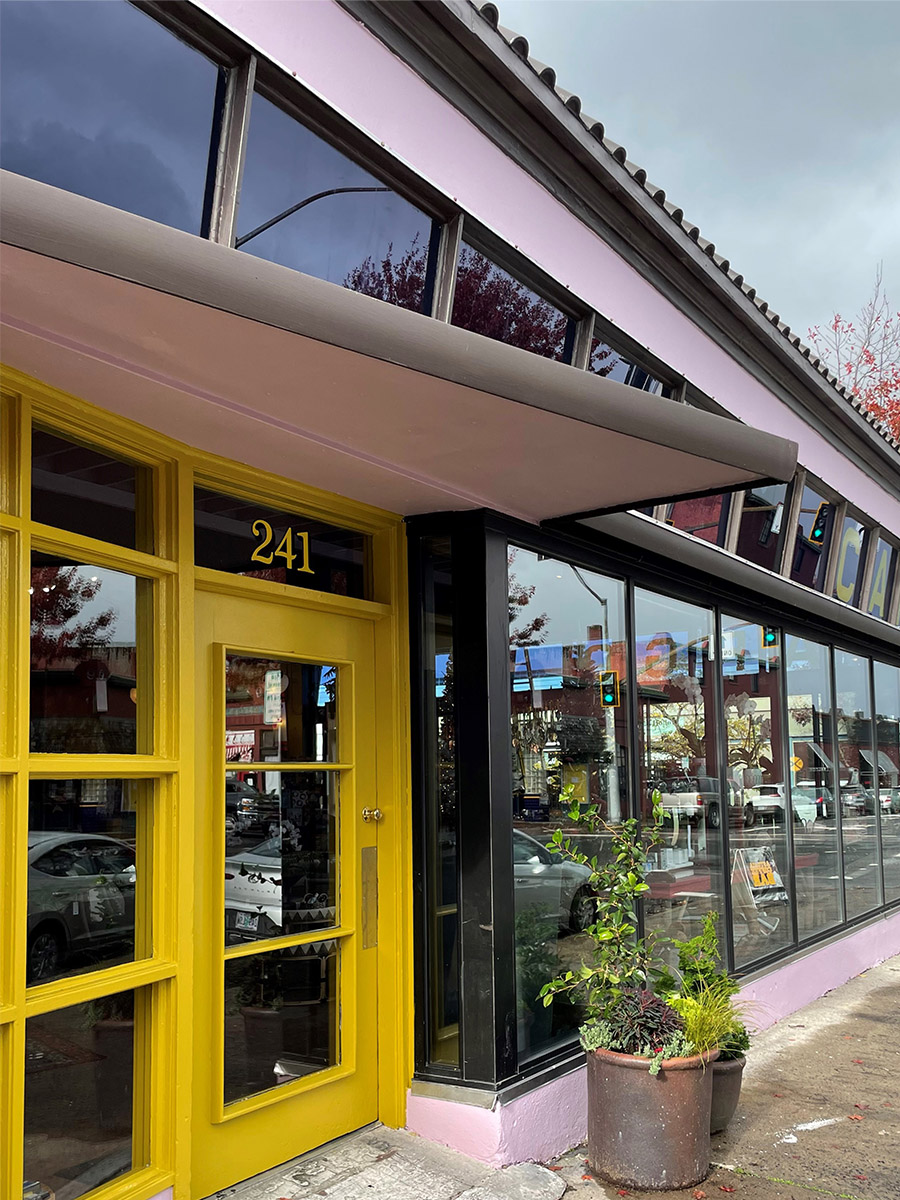
You used Desireé | 1219 – our 2022 Color of the Year – on both the exterior of the building and inside on the ceiling. Why did you choose to have the same color both inside and outside?
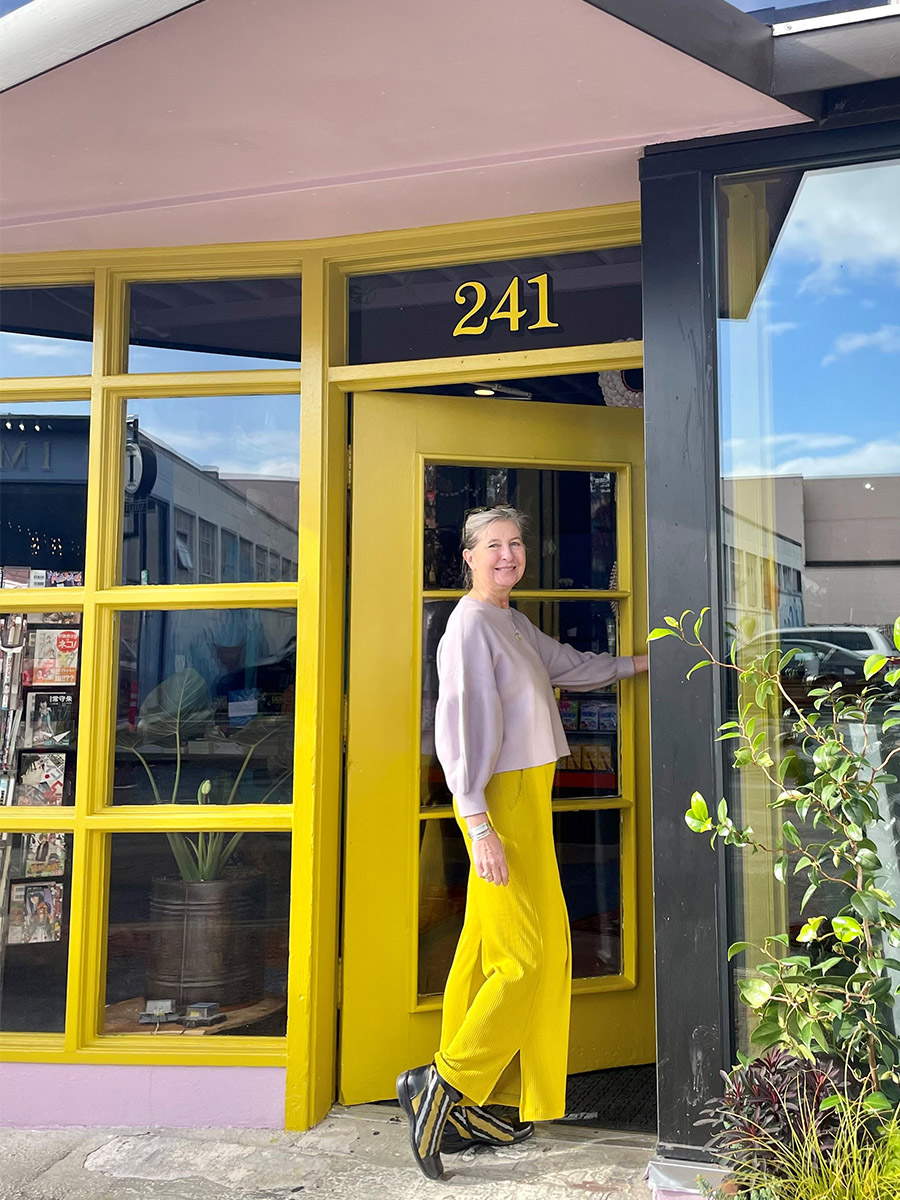
I loved the idea of the consistency of the colors being used both inside & out, even though we flipped where they were being used. As you enter the door way which is painted in a high gloss Hair Ribbon | 0809, you look into the store to see the lighter tone Yellow Lupine | 0808 on the back wall. The choice of the Blue Jacket | 0591 on the accent walls – almost reflected the light coming through the cobalt glass transom windows. We just love how Desireé | 1219 glows in the coastal light & pops on a day filled with coastal fog. Another happy pairing was our signage on the transom widows, which was made to match Hair Ribbon | 0809.
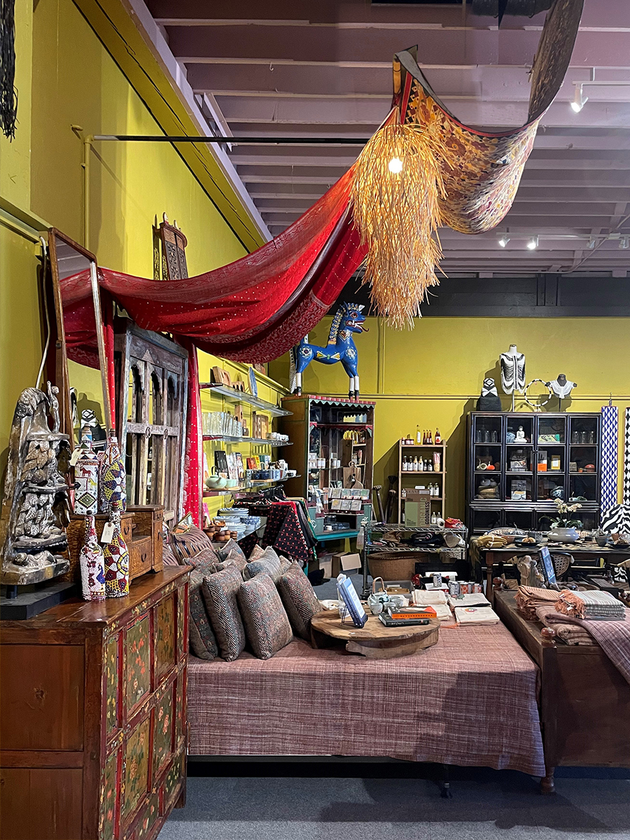
By combining interior walls Yellow Lupine | 0808 with orchid ceiling Desireé | 1219, you created a complementary color combination. Sometimes this type of combination can be too intense for some spaces. Why do you think it works so well in Cargo?
I knew a needed a color combination that would be robust enough to hold up to Cargo’s extensive collection of textiles, and I love to use unexpected color combinations to enhance one of a kind goods. When placing art, furnishing or one of a kind pieces, I always to look to find a color that complements & enhances not only the pieces but the space as a whole.
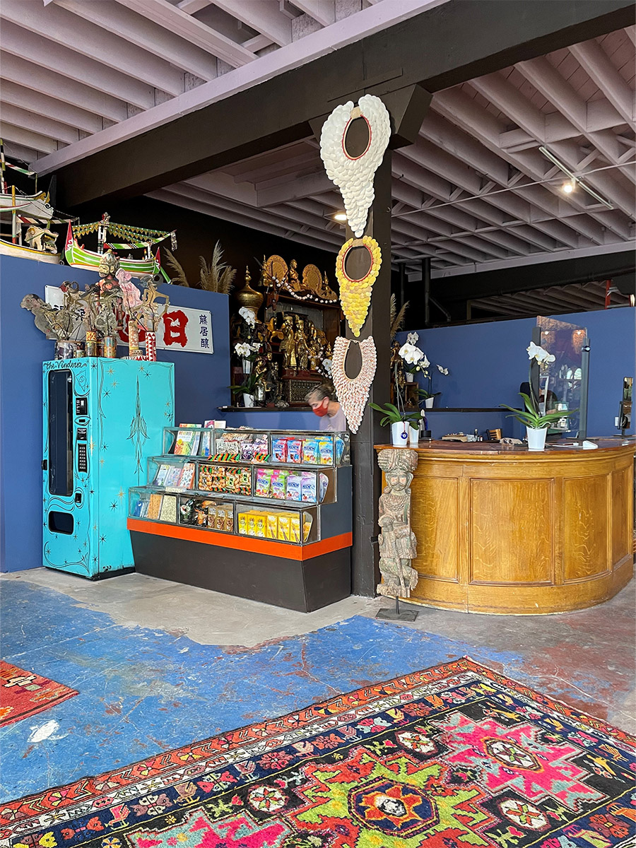
You used color-blocking to denote certain areas of the store and direct customers, like the use of Blue Jacket | 0591 behind the cash wrap. Can you give some examples of how people can use color to carve out spaces at home?
As I mentioned above, selecting the art or object for a space & a color that complements can really set the stage, however that color might be too much for the space overall. An accent color in an entry, dining or living space, or behind a bed can be a great solution to support the art & not overwhelm the space.
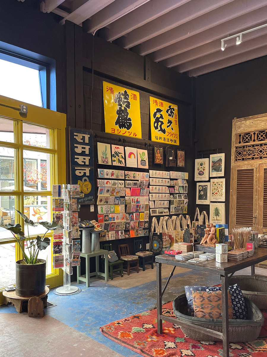
Why did you choose Evermore | 0557 as the grounding neutral in your palette?
I knew we needed a dark color for the trim to work off the storefront trim, and accent the spaces sizable posts and beams, and originally chose deep green Battle Spruce to offer a “historic” reference. However, after reviewing draw downs, we opted for the deep brown with purple undertones of Evermore because it is more harmonious with Desireé | 1219 – in bother the interior & exterior settings.
As a designer and creator of all of the visual delight at Cargo, you are clearly not afraid of color. What is your advice for people who love color, but are not sure how to incorporate it into their own homes?
I’d say to start by using bolder color in transitional space, like an entry wall, guest room, or half bath, this will allow you to have the positive experience of a dramatic color in a space that you feel free to experiment in. Another tip is to sample the color in your space ahead of time picking two colors (or shades) – your safe choice & the second more dramatic choice – you may be surprised that what you thought was too much is actually just right!
